
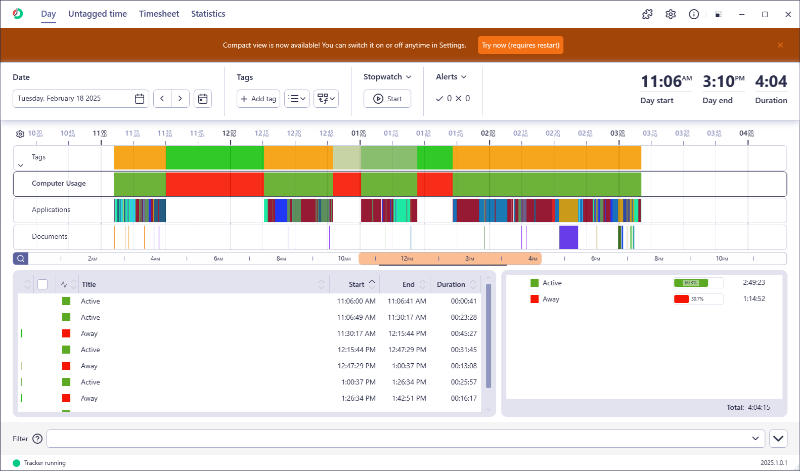
In our last update, we introduced a fresh, modern UI to ManicTime. While many users appreciated the new look, we also heard a lot of feedback. The number one concern? The new design took up too much space.
Some users loved the openness, but many felt that the UI “breathed” a little too much, making it harder to see their data at a glance. In a tool like ManicTime, maximizing data visibility is often essential. So, we listened. And we acted.
Introducing Compact View
The new Compact View brings a more space efficient layout that closely resembles the previous design. It reduces margins, minimizes padding, and tightens up UI elements, allowing you to see more of what matters.
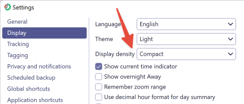
If you’re upgrading from version 2024.3, you’ll see a banner notifying you that Compact View is available. If you’re coming from an earlier version, you can find it under Settings > Display > Display density.
What’s Different?
- Smaller UI elements – Less padding around buttons, menus, and panels.
- Tighter spacing – More data fits on the screen at once.
- Efficient layout – Key sections are easier to scan without unnecessary empty space.
How to try
Compact view was added in v2025.1, which is currently in beta. You can download it here.
Let Us Know What You Think
We’re always evolving based on your feedback, so keep it coming! If Compact View makes ManicTime better for you, or if there are other improvements you’d like to see, drop us a message.
Thanks for sticking with us as we refine ManicTime to be the best time-tracking tool it can be. More updates coming soon!